Simple CSS Image Hover Effects with Text (Code + Demo)

If you want to add Hover Effects to any image then this tutorial is for you. Here I will show you how to create image Hover Effects with Text using CSS and HTML.

 Different types of CSS Hover Effects can be added to the image. One of the notable ones is text. This type of CSS Hover Effects with Text design will have some text in the image. 

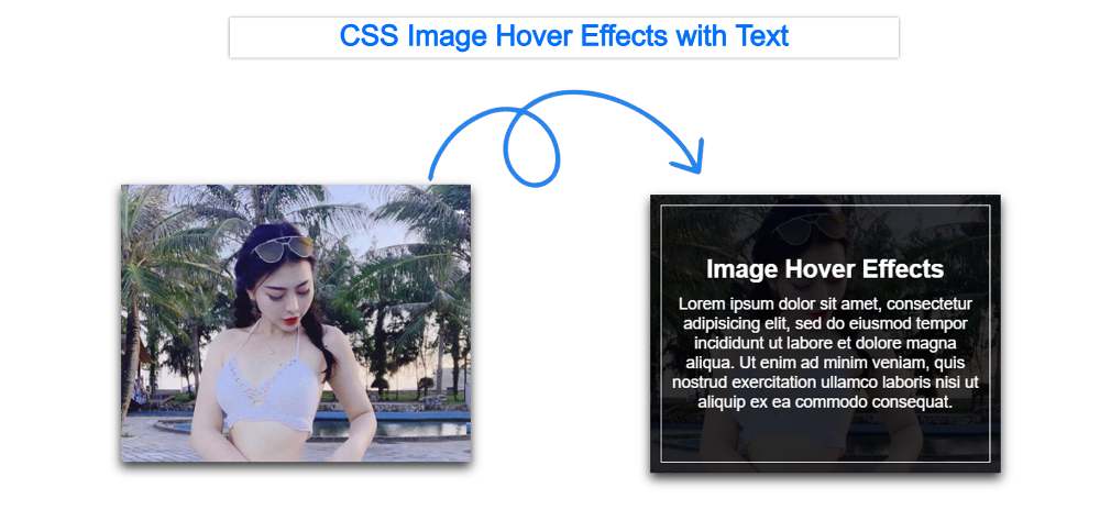
However, those texts cannot be seen. You can see it when you hover over the image. A kind of border animation can be seen with this. All these things are maintained only by CSS.

CSS Image Hover Effects with Text


The designs I have already shown will show different types of border animation, color animation, and hover zoom. 

Although this kind of cool image hovers effects you will find a lot on the Internet. But this tutorial will be best for you. Because here I will discuss with you how it was created and how you can add Hover Effects with Text to any of your images. So if you are a beginner and want to know something new then you must follow this tutorial.

CSS Image Hover Effects with Text

As you can see I have added an image to the webpage. When you hover over the image, the background of the image becomes a bit black. Also, all the tests that were hidden can be seen. 

A heading is used here and some paragraphs are used. A kind of border animation has been used with it. This means that when you hover over the image, you will see a border around this image.

Now if you want to create this Simple CSS Image Hover Effects with Text then follow the steps below. If you only want the source code then be sure to use the download button below the article.

I used HTML and CSS to make it. So you create an HTML file and a CSS file. Add the following HTML codes to the HTML file and CSS to the CSS file.


Step 1:

HTML of Image Hover Effects

First I created the basic structure i.e. a box. I have added the image to it. The image can be viewed throughout the box. Then I added a heading and some text. Opacity: 0 has been used for these headings and texts.


<div class="container">
 <div class="box">

  <div class="imgBox">
    <img src="https://ttol.vietnamnetjsc.vn/images/2019/08/14/06/43/nu-dien-vien-phu-phim-Ve-nha-di-con-8.jpg">
  </div>

  <div class="content">
    <h2>Image Hover Effects</h2>
    <p>Lorem ipsum dolor sit amet, consectetur adipisicing elit, sed do eiusmod
       tempor incididunt ut labore et dolore magna aliqua. Ut enim ad minim veniam,
       quis nostrud exercitation ullamco laboris nisi ut aliquip ex ea commodo
       consequat. </p>
  </div>

 </div>
</div>


Step 1:

CSS of Image Hover Effects with Text

The images have been designed using some of the following CSS and this CSS Image Hover effect has been activated. First I designed the image. Then I added Border Animation.


body {
    margin:0;
    padding:0;
    font-family:sans-serif;
}

.container {
    position:relative;
    width:1200px;
    height:600px;
    margin: 100px auto;
}

.container .box {
    position:relative;
    width:calc(400px - 60px);
    height:calc(300px - 30px);
    background:#000;
    float:left;
    margin: 25px;
    box-sizing:border-box;
    overflow:hidden;
    box-shadow:0 5px 10px rgba(0,0,0,.8);
}


.container .box:before {
    content:'';
    position:absolute;
    top:10px;
    left:10px;
    right:10px;
    bottom:10px;
    border-top:1px solid #fff;
    border-bottom:1px solid #fff;
    box-sizing:border-box;
    transition:0.5s;
    transform: scaleX(0);
    opacity:0;
}

.container .box:hover:before {
    transform:scaleX(1);
    opacity:1;
}

.container .box:after {
    content:'';
    position:absolute;
    top:10px;
    left:10px;
    right:10px;
    bottom:10px;
    border-left:1px solid #fff;
    border-right:1px solid #fff;
    box-sizing:border-box;
    transition:0.5s;
    transform: scaleY(0);
    opacity:0;
}

.container .box:hover:after {
    transform:scaleY(1);
    opacity:1;
}


.container .box .imgBox {
    position:relative;
}

.container .box .imgBox img {
    width:100%;
    transition:0.5s;
}

.container .box:hover .imgBox img {
    opacity:.2;
    transform:scale(1.2);
}


.container .box .content {
    position:absolute;
    width:100%;
    top:50%;
    transform:translateY(-50%);
    z-index:2;
    padding:20px;
    box-sizing:border-box;
    text-align:center;
}

.container .box .content h2 {
    margin: 0 0 10px;
    padding:0;
    color:#fff;
    transition:0.5s;
    transform:translateY(-50px);
    opacity:0;
    visibility:hidden;
}

.container .box .content p {
    margin:0;
    padding:0;
    color:#fff;
    transform:translateY(50px);
    opacity:0;
    visibility:hidden;
}
.container .box:hover .content h2,
.container .box:hover .content P {
    opacity:1;
    visibility:visible;
    transform:translateY(0px);
}


Hopefully, you have been able to create this CSS Image Hover Effects with Text using the code above. If there is any problem then you can definitely let me know.


Comments

Popular posts from this blog

Splash Image Mask Using HTML and CSS (Free Code)

Simple Day Night Toggle Button Using HTML and CSS

Simple RGB Color Generator Using JavaScript & CSS