Simple Gradient Button Animation using CSS (Free Code)
This article will help you to know how to create Gradient Button Animation using HTML and CSS. There are many types of buttons, but the gradient is the most significant.
Earlier I shared various tutorials like Gradient Button CSS, Neon Button, etc. These designs are much more attractive and beautiful than simple button designs.
Here I have created this Gradient Button Animation using only HTML and CSS. In the case of the CSS Gradient Button, different colors are beautifully arranged in the background. Also available in different color animations.
Gradient Button Animation CSS
Below I have given a demo that will help you to know how this Gradient Button Animation CSS works. Of course, you need to have a basic idea about HTML and CSS.
In this article, you will find the required source code, step-by-step tutorials, and previews.
See the Pen Untitled by Ground Tutorial (@groundtutorial) on CodePen.
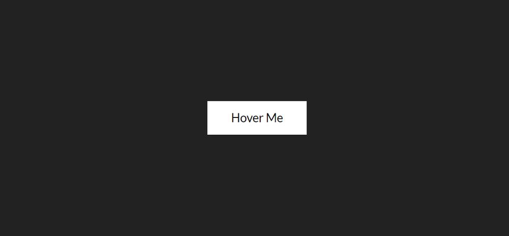
As you can see above, a button has been created on the web page. I used the button element of HTML to create this button. Then that button has been designed with the help of CSS.
Many background colors have been added to that button. Background colors can be seen in the medium of animation. When you hover or click the mouse on this button, the background color can also be seen behind the button.
How to create CSS gradient buttons
That means a colorful shadow can be seen behind the button. This is why this Gradient Button Animation has reached its maximum beauty. Here you can change the color to your liking.
Step 1: Basic structure of Gradient Button
The basic structure of this button has been created using the following HTML and CSS codes. First I created a button using HTML's button function. Here the background color of the web page is black.
Step 2: Button's basic design
The basic design of the button has been done using the following CSS. The size of the button depends on the padding and I have used font-size: 1.5rem to increase the text size a bit.
Background white color has been used. I later added different gradient colors. The animation is used here and the time is set at 8 seconds. I have explained at the end of this article why this animation has been used.
I have added background color in the button using the following CSS. As you can see here using linear-gradient I have added many colors and each color can be seen at a 90-degree angle.
The size of the background has been increased to 300% to make the color of the button's background clear and beautiful. That is three times the normal size has been increased.
Step 3: Add hover effect to the button
Now a color shadow has been arranged on the back of the button using CSS before. The color that can be seen in the background of the button can be seen behind the button.
Below I have arranged to show these colors using the hover effect. As you can see in the demo, when you click on the button, you can see the neon color of the button.
I used filter: blur (20px) to make the background color a bit blurry. Here I have used 'opacity: 1' using hover. This means that when you click on this button or move the mouse, you will see this animation.
With that, I used an animation here and set its time to 8 seconds. I used this animation button in the background. I have added the same animation in both cases. The button has been activated using @keyframes.
I hope you have learned how to create this Simple Gradient Button Animation from the tutorial below. Be sure to comment on how you like it. Use the button below to download the source code of this CSS Gradient Button Animation.


Comments
Post a Comment
Tell me what you think ??😎