Simple Floating Label Animation using HTML & CSS
If you want to create simple floating-level animations using HTML and CSS then this tutorial is for you. Here you will find complete information and a step-by-step tutorial for creating a floating label using CSS.
Floating label input css can be found in different types of login forms, registration forms, etc. Where the label is floating. Usually, we use labels in the input box. This label helps to know what to input in an input box.
This label is at the top of the input box. The input box we created here contains the label input box. That is, the label has been placed in the place of the placeholders.
Floating Label Input CSS
Below is a demo that will help you learn how it works. I used HTML CSS and some jquery to make it.
See the Pen Untitled by Foolish Developer (@foolishdevweb) on CodePen.
I have created a small box on the webpage as you can see above. That box contains two inputs. There is no border around those input places. There is only a border at the bottom.
When you click in that input box, the label will move upwards. And input space will be created. In this Floating Label Animation design, I have used both label and placeholder. Under normal circumstances the label is visible and the placeholder is hidden.
When you click on the input box, the label will move slightly upwards and the placeholder will be visible. This type of Simple Floating Label Animation is much more interesting than a simple input box.
Create a Floating Label Input with HTML CSS
HTML's input function has been used to create a floating label using CSS. Below I have shared a step-by-step tutorial on how to create it. For this, you must have a basic idea about HTML CSS.
Step 1: Basic structure of input area
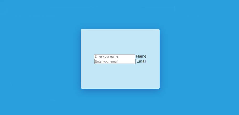
I have created the basic structure of this project using the following HTML and CSS codes. That means a box has been created on the webpage. You can see two input boxes in it.
The webpage has been designed using the following CSS. Here I have used blue as the background color of the web page.
I have used the width: 330px, height: 250px of the box on that page, and light blue color has been used in the background of the box.
Step 2: Add two input boxes and a label
I have created two input boxes using the following HTML. The first input box to input the name and the second input box to input e-mail. I used HTML input to make each input box and I used a label with both.
Step 3: Basic design of input box
I have used the following CSS to design the input boxes. Transparent color has been used in the background of this input box, that is, the background can be seen completely.
Now I have managed to hide the border of the input box under normal conditions. A 2-pixel border can only be seen at the bottom instead of the border.
Step 4: Design the placeholder
The following CSS has been used to design the placeholder. Here I have used opacity: 0 which means that the placeholder cannot be seen under normal conditions. Then I used opacity: 1 using ': focus' which means when you click on this input box you will see the placeholder.
Step 5: Design the Floating Label by css
Now I have used the following code to design the label. I have used font-size: 1.3rem to increase the text size of this label.
Now I have executed the label. I have instructed that when you click on that input box then the following code will work. It is stated here that the label will go up to 28px and the text color will be red.
This is not possible without JavaScript, which means that the image I have shown below can be seen after using JavaScript. Without JavaScript, you can't see the results of the image below.
Step 6: Activate floating label input
Above we have added the necessary information for Simple Floating Label Animation. We have designed it and now we have to use JQuery to make it work.
Two types of terms have been used here. What happens when you click on the input box and what happens when you click outside the input box.
➤ The first instruction is to add the 'onFocus' element when you click on that input box. I have added all the values of 'onFocus' in CSS.
➤ I then instructed that the 'onFocus' element will be removed when you click anywhere other than the input.
Hope you learned from the above tutorial how I created this floating label input CSS. Earlier I created various login forms, registration forms in which this type of Simple Floating Label CSS has been used. Use the button below to get the required source code for this Animated Floating Input Label.


Good Design and Tutorials
ReplyDelete